“We love the clean design and enhanced mobile experience. The results are proving the investments we made in the mobile user experience assessment and new redesign are paying off.”
Former Marketing Director
Pella Regional Health Center
In rural areas, people rely on mobile networks to access the web. This is something Pella Regional has witnessed firsthand. Headquartered in Pella, IA, this growing health system has seen a 36% increase in mobile traffic since 2017, correlating with their growing footprint and medical clinic expansion into more rural communities.
That’s why when the organization set out to redesign their web presence in 2019 with their long-time agency Geonetric, they wanted to create an exceptional user experience for both desktop and mobile users. The organization had already gone responsive, but with this new site, they wanted to put mobile user experience front and center. The new site, which launched in June of 2019, does just that, boasting a new design, new functionality, and results that demonstrate how much mobile users appreciate the approach.
Uncovering insights
As part of the redesign, Geonetric worked with Pella Regional to administer a mobile user experience assessment, digging deep into their site’s mobile performance. The team evaluated traffic trends across organic, direct, display, social, paid search, and referral sources. They also reviewed content for the top mobile landing pages and analyzed exit pages for mobile users.
The team also looked at section-specific performance, including page load speeds for each section, as well as user heat mapping and scroll mapping to study how users’ mobile interacted with the site. Finally, the team reviewed mobile conversion opportunities across the site, evaluating clickable phone numbers, online forms, and above-the-fold calls-to-action.
From this analysis, the team was able to create a set of priorities and tactics focused on improving the mobile user experience.
Redesigning the site
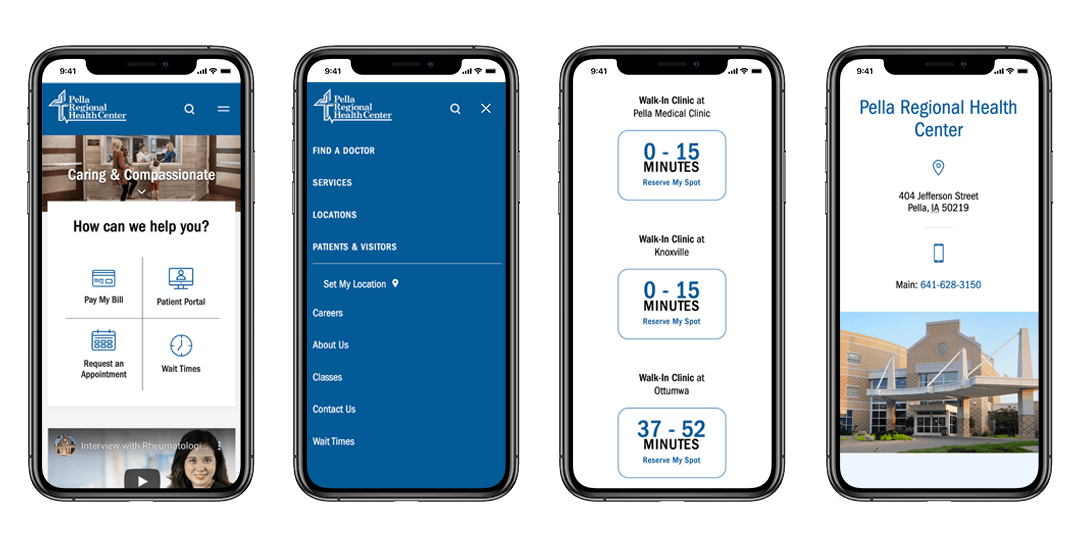
To support their mission and focus on the organization’s caring and compassionate values, the new site showcases photography with real staff and patients. The large homepage hero image featuring a family visiting a new baby sets the stage for the type of patient-focused care you receive at Pella Regional.
The longer homepage matches content to the way mobile users scroll and doesn’t limit content — just presents it differently on desktop and mobile. It provides visual cues, such as arrows, to keep users on the right path. It also uses large icons to call out their highest priority calls-to-action and displays eye-catching wait times, a top mobile task. Pella Regional also added more videos throughout the site, as mobile users tend to interact with video content.
Unique mobile-focused elements included rethinking mobile navigation. When accessed from mobile devices, the menu is partially hidden until the user taps on it, reducing the amount of screen space it takes up. The menu is streamlined to two horizontal bars that creates an X to close. When opened, the user is offered the same primary and secondary navigation as a desktop user, as data suggested mobile users still were accessing the same content, including locations, services, and providers. On a desktop, the user gets larger mega-menus that show multiple locations and offers module search right from the dropdown.
The redesigned site also boasts new features and functionality that delivers an improved experience to all users, including custom location profiles and custom provider profiles that include ratings and reviews. The site also has geographic targeting personalization, providing customized user experiences for site visitors who share their ZIP code.
Mobile-focused results
Mobile users are engaging with the new site. Since launch, the bounce rate for mobile has decreased by 23%, pages per session from mobile users has increased by 17%, and average session duration on mobile has increased by 21%.
Locations had 1,000 more sessions from mobile than desktop, with large increases in users landing on their walk-in clinic location profiles and the walk-in service line pages, which are services people are looking for on mobile. In general, users on mobile devices click provider ratings and reviews slightly more often than users on a desktop.
In addition, 71% of the activity on wait times came from users on mobile devices, and 80% of interactions with the task navigation were from mobile devices.
Website Redesign Focuses on Engaging Mobile Audience