


Health Equity is a complex challenge with multiple root causes and contributing factors making it difficult to know where to start. For many government and healthcare organizations, mapping health equity using a Geography Information System (GIS) was the best place to start. By showing health equity issues on a map, several organizations and individuals who presented at the 2022 Esri User Conference were able to spur action and direct resources to the areas that needed it the most.
Incorporating Race into GIS Dashboards
In 2019, the County of Milwaukee became the first jurisdiction in the country to declare racism a public health crisis. Since that declaration, the County has worked to incorporate race and race-related data into their decisions.
Their public-facing COVID-19 dashboard, for example, allows citizens to view key public health information sorted by race – laying bare any potential health disparities.
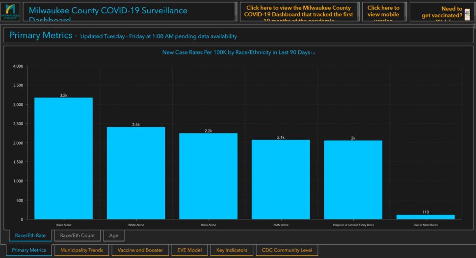
For their work, the County of Milwaukee won a SAG Award from Esri, the company that make the GIS platform that is used to visualize the data.
PublicHealthMaps is an independent, data-driven, 501 (c)(3) nonprofit organization based in the Washington, District of Columbia metropolitan area. In 2021 they partnered with the Latinx Voces Task Force to support the U.S. Department of Health and Human Services’ “Juntos sí Podemos/Together We Can Do This” public education campaign against COVID-19. Part of that support included an interactive map of the Latinx community in the US which makes it easier to track the impact of COVID-19 on that community.
Professor Carsten Lange, from the California State Polytechnic University in Pomona presented intriguing results from his work (with his wife) on using ML and AI to predict COVID-19 vaccine hesitancy in US counties based on:
- Race (Asian, Hispanic, African American, White)
- Age (Young vs Old)
- Socioeconomic status (Poverty level)
- Politics (% of Republican voters)
Professor Lange is still compiling his full findings, but he highlighted that no one single factor was enough to be determinant for vaccine hesitancy. There were some counties that were clearly Republican that had high vaccination rates where others did not. There were some counties with the same % of African Americans, yet one had a high rate of vaccination while the other was extremely low.
You can explore his work here https://www.arcgis.com/apps/dashboards/e41bde52d4f743ce8f931009c15c8c9c
Identifying Vulnerable Communities
The CDC Social Vulnerability Index (SVI) uses 15 US Census variables to identify communities that may need additional support to ease human suffering in the event of a natural or human-caused disaster or a disease outbreak.
The County of Milwaukee calculated the SVI for each of their districts so that it could be used as a factor in their GIS analytics. By plotting COVID-19 case rates vs SVI, the County was able to identify “hot spots” – areas of high COVID-19 occurrence and high vulnerability.
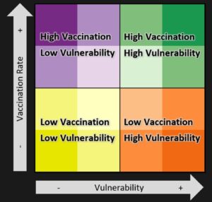
These hot spots were marked in orange on the map below:
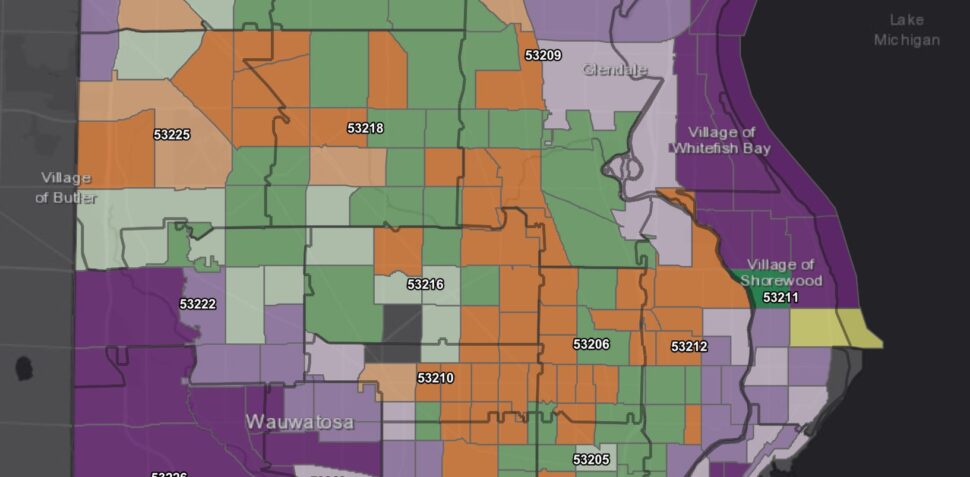
The County’s goal was then simple: get the oranges to green – which they achieved through a combination of mobile testing + vaccination sites, public awareness campaigns, and engagement with local community leaders in the orange zones.
Sightsavers is a non-profit organization that works in more than 30 countries to prevent avoidable blindness and fight for the rights of people with disabilities. They launched a new initiative in Kenya to address the increasing prevalence of Trachoma – a disease which causes eyelashes to scrape against the eye, causing pain and leading to irreversible blindness.
To ensure treatments are getting to the people who need it most, and to track the effectiveness (or non-effectiveness), Sightsavers uses Esri’s ArcGIS platform. Their Trachoma work, builds on their prior work in Africa where they used GIS to ensure treatments were distributed based on need.
Encouraging Signs
It was heartwarming to see so many presentations at the Esri User Conference that had a health equity component. The first step to addressing this complex issue is to highlight it and get people to start talking about it. Only through discussion and sharing of ideas can we move to collaborating on solutions. Milwaukee County, Professor Lange, Sightsavers, and PublicHealthMaps did a fantastic job at shining the light on health equity.
Esri is a proud sponsor of Healthcare Scene.


