 Whenever software friends visit Adaptive, I make a point of showing them a multichannel pipette. It’s actually a pretty cool piece of technology, but from a design perspective it just feels wrong. Like, if one pipette is good, then a ton of them must be even better, right? Maybe not. At some point, incrementing old solutions isn’t enough. That’s why robots are taking over the job of liquid handling in the lab — they’re just fundamentally better at it than people, no matter how many tips you cram onto the end of a manual pipette.
Software in biotech is in the same place as the pipette, but even more so. Celebrity gossip surfing habits are mined in real time using the latest cloud-based “big data” technologies, but your genome is still largely analyzed by some old Perl code on a Commodore 64 that requires a statistics module written in 1925 by some woman that threw away the source (I will cop to a bit of hyperbole here, but far, far less than you want to know).
There is simply no excuse for this. Biology is hard enough. Researchers should not have to learn to program just to understand their experimental data. They should have flexible, real-time, visualization-rich tools at their fingertips. Tools that highlight patterns and provide answers, leading immediately to the next question, the next discovery, and the next answer.
We get it. Which is why we’re not just creating unbelievable assays (although we are doing that too) — we’re creating end-to-end solutions that include the tools our customers and partners need to figure out what those assays are saying. We just released the latest version of these tools, and I believe they are game changing.
I am seriously excited about this. The marketing team made a pretty fantastic video showcasing the brand new immunoSEQ Analyzer 3.0 experience — if you’re already sick of reading, feel free to head over and check it out at http://adaptivebiotech.com/immunoseq/analyzer. Woot!
Still here? OK then — a bit more about what we’ve built.
Supporting Experimental Design
Research runs on experiments and publications. The design of these experiments is critical — what are the cohorts, what is being measured, and how will results be compared and evaluated. The Analyzer is built on top of these same concepts, so you see data in the right context, without having to do a bunch of manual pre-processing.
In the Analyzer, samples can be easily tagged with metadata to segment and correlate observations using experiment variables. Researchers can draw from our rich library of tags, or create their own as needed. This metadata travels with the samples, always available to help guide analysis.
This magic here is subtle, but super-powerful. Metadata defines “comparison groups” — control vs. protocol, pre- vs. post-treatment, one demographic vs. another, responders vs. non-responders, etc. — whatever groupings are relevant can be used to drive visualizations.
And once conclusions are drawn and work is published, the Analyzer provides, free for our customers, a repository where data can be publically shared interactively. Figures can be saved with the data, which remain completely dynamic for readers to explore. Readers can even incorporate published data into their own work, enabling new research to build easily on what has come before. The potential of these “Published Projects” is ridiculous, and will be the subject of its own post soon.
Designed for Immunology
We’ve learned which metrics matter – so we make them available right out of the gate. We can segment productive and non-productive receptors, characterize sample clonality, report CDR3 length and the genes and alleles that contribute to a particular rearrangement, pinpoint somatic hypermutations in B-cells, measure the density of receptors within tissue, and much more. All of these values are delivered with clear, online documentation as to how they were derived.
 In the same way, the visualizations that we’ve built are custom-designed for immune research. For example, Combined Rearrangements and Scatter Plots illuminate the “overlap” between cohorts — not just the amount of, but the specific sequences that are shared.
The really cool thing here is, as we learn more, we just keep driving that experience back into the Analyzer. We’ll be doing more and more of this, and because the tools are delivered online, they upgrade magically without any downtime or local IT hassles.
Extra Power with Advanced Tools
Of course, science is about new questions and discoveries. So no matter how much we bake in, there will always be a need to reach just a bit farther. Traditionally in biotech, this is a “cliff” — download huge data files and start writing code to process them. More often than not, this barrier means it just doesn’t happen. We’ve worked hard to add capabilities that minimize this challenge, and frankly I think we’ve nailed it.
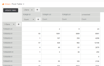 First, check out the Pivot Table view; it’s a point-and-click interface for creating aggregations and cross-tabs. For example, if you want to just see how many unique rearrangements were called against each V Gene, just add the V Gene column on the left, pick Count in the values section in the middle, and go. Want to segment that further by V allele? Just add it on the left. Want to cross-tabulate those against J Genes? Just add that at the top of the chart using the “+” button and you a complete two-dimensional table of counts by V and J. Bam. Once you get the hang of it, it’s really fun to play with data in this environment.
Then there’s my favorite — the Advanced Query view. Advanced Query exposes immunoSEQ data as two “tables” of rows and columns, one for samples and one for rearrangements / sequences. A robust implementation of the SQL query language sits on top of these tables thanks to Apache Spark … and you can do amazing things with it.
Here’s a simple one; find all amino acids within a Levenshtein edit distance less than 3 from a particular sequence:
select amino_acid, templates, reads from sequences
where Levenshtein(amino_acid, 'CATWDLKKLF') < 3
 Kaching! This really is a supercharged interface. SQL syntax can also be a bit of a bear, but there is a ton of documentation out there – and it is way better than cracking open that Perl book and starting from scratch!
It all starts with Spark
I could (and often do) run on forever about all the work the team has put into making the new Analyzer, hands down, the world’s best immunology research tool. But I’m going to wrap up today with just one more tease, this time about the backend that drives all that great experience.
All this great functionality comes at a price. The tools require massive amounts of computation, far beyond what we could reasonable provide with traditional database-backed systems. And while there are tons of great large-scale processing technologies out there, most of them are built for long-running offline computation — they’re just not made for real-time, highly iterative experiences like the Analyzer.
Enter Apache Spark. Spark is a pretty remarkable new technology that attempts to solve exactly this challenge — provide “big data” capabilities in support of a real-time environment. And you now, it just works great. We use a combination of Spark SQL and hand-coded map/reduce style jobs — Spark enables many ways of working with data. It is truly amazing technology, and will also be the subject of a more detailed post soon.
There is so much new stuff in this release that it’s hard to start teasing out clear and concise messages. I am incredibly proud of the team that built it. We’re a great mix of long-time biotech folks and long-time software folks — it’s a great recipe for awesome.
And I promise to write much more about all of these bits and pieces over the coming weeks. In the meantime, if you’ve got any questions about the new release, just drop me a note here. Releasing stuff is great, but it only really matters when customers use it to do good work — and we are super-motivated to help you make that happen.
Thanks!
