
Over the past few years, we’ve been using Storybook in Sitecore SXA theme development. It has provided us with a few key features that aid in accelerating our front-end development (FED) workflow:
- Node development environment with Hot Module Reloading (HMR)
- Disconnected environment not reliant on Sitecore
- Community Add-on to aid web accessibility (a11y) testing
- On the fly documentation with Docs add-on
In addition to the above development experience advantages, leveraging Storybook also gives FEDs a consistent workflow when moving between projects built on CMS’s beyond Sitecore, e.g. Episerver.
This article will cover the following topics:
- What is Storybook?
- Setting up Storybook in an SXA theme
- Customizing the Storybook theme for your brand
- Working with Public Assets
- Working with theme Sass and JavaScript in Storybook
- Working with Template Code
- Development Workflow and Conclusion
We will be starting with a fresh SXA theme, but if you would like to see the finished Storybook seed, please visit this Github repo. It contains just the pertinent Storybook files to make dropping it into any project easier.
Part 1. What is Storybook
In the organization’s own words:
Storybook is an open source tool for developing UI components in isolation for React, Vue, Angular, and more. It makes building stunning UIs organized and efficient.
Installing Storybook into a project adds a local Node.js development sandbox that allows developers to create, test and document components in isolation.
When launching the Storybook UI, Sitecore FEDs can test the Sass and JS that are later imported into Sitecore (SXA) or bundled onto a server. Traditional projects have often involved a dizzying array of HTML files referencing some, or all of the source assets. Storybook makes this consistent and augments the developer experience with a variety of official plugins as well as access to an entire community of open-source add-ons. Let’s take a look at adding Storybook to an SXA theme.
Part 2. Setting Up Storybook in an SXA Theme
Now that we have a handle on what Storybook is and why to use it, let’s explore adding it into your SXA theme.
The below examples are made on the assumptions that you are working in a traditional SXA theme. The directory structure is up to you, but you may need to update references/imports based on your preferences.
Directory structure:
theme/
├── -/
│   ├── scriban/
│   └── metadata.json
├── gulp/
├── sass/
├── scripts/
├── sources
├── styles
├── package.json
└── README.md
-
- Add the following dependencies to you package.json:
// package.json
{
  "scripts": {
    "dev": "start-storybook -p 6006 -s public"
  },
  "dependencies": {
    "prop-types": "^15.7.2",
    "react": "^17.0.1",
    "react-dom": "^17.0.1"
  },
  "devDependencies": {
    "@babel/preset-react": "^7.10.4",
    "@storybook/addon-a11y": "^6.1.14",
    "@storybook/addon-actions": "^6.1.14",
    "@storybook/addon-essentials": "^6.1.14",
    "@storybook/addon-links": "^6.1.14",
    "@storybook/addons": "^6.1.14",
    "@storybook/node-logger": "^6.1.14",
    "@storybook/react": "^6.1.14",
    "@storybook/theming": "^6.1.14",
    "babel-loader": "^8.2.2",
    "core-js": "^3.8.3",
    "css-loader": "^5.0.1",
    "file-loader": "^6.2.0",
    "html-loader": "^1.3.2",
    "sass-loader": "^10.1.1",
    "style-loader": "^2.0.0",
    "webpack": "^4.44.2",
    "webpack-cli": "^3.3.12"
  }
}
npm install
Install the dependencies with the above command
- Update your babel configuration to include the following:
{ "babel": { "presets": [ "@babel/env", "@babel/preset-react" ] } } - Create a .storybook folder in your directory with the following files and contents:
theme/
├── .storybook/
│   ├── main.js
│   └── preview.js
└── ...
// main.js
const path = require('path');

module.exports = {
  'stories': [
    '../src/**/*.stories.@(js|jsx)' // configures where story files are located
  ],
  'addons': [ // adds necessary addons to the project
    '@storybook/addon-links',
    '@storybook/addon-essentials',
    '@storybook/addon-a11y'
  ],
  // custom webpack configuration
  webpackFinal: async (config, { configType }) => {
    config.module.rules.push({
      test: /\.(js|jsx)$/,
      exclude: /node_modules/,
      use: [
        'babel-loader',
      ],
    });
    config.module.rules.push({
      test: /\.scss$/,
      use: [
        'style-loader',
        'css-loader',
        'sass-loader',
      ],
      exclude: /node_modules/,
    });
    config.module.rules.push({
      test: /\.(woff|woff2|eot|ttf|otf)$/,
      use: [
        'file-loader'
      ],
      include: path.resolve(__dirname, '../')
    });
    config.module.rules.push({
      test: /\.(html|cshtml|scriban)$/,
      use: [
        'html-loader'
      ],
      include: path.resolve(__dirname, '../')
    });
    return config;
  },
}
// preview.js // leave empty for now, we'll discuss importing theme assets in a subsequent section
- Create your first story – in the theme root, create a directory src/ and inside create a file called example.stories.js with the following contents:
theme/
├── ...
├── src/
│   └── stories/
│       └── example.stories.js
└── ...
// import dependencies import React from 'react'; // Story metadata export default { title: 'Test', // configures the folder structure Storybooks UI }; // a story (as a React functional component) // you can have multiple stories in a file export const standard = () => ( <div> Yo! </div> )Note: in step 3 above, we added a line that will configure Storybook to automatically import any file in theme/src/ that ends with .stories.js, so you will not need to manually import any story files 🙂
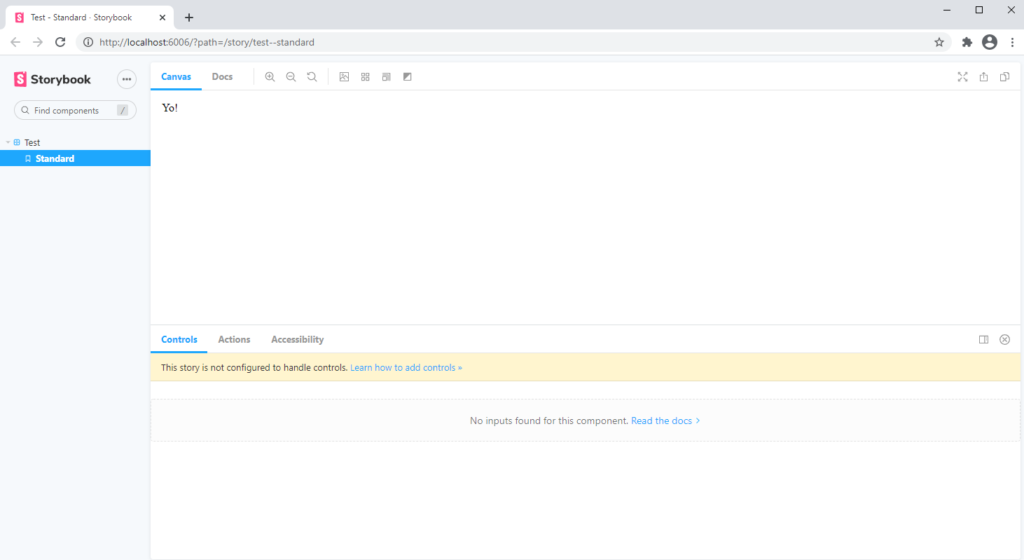
- Run Storybook – with this all setup correctly, you should now be able to open any terminal and run the following command (previously added to the package.json in Step 1):
npm run dev
- Add the following dependencies to you package.json:
Your browser should open to http://localhost:6006 with the following
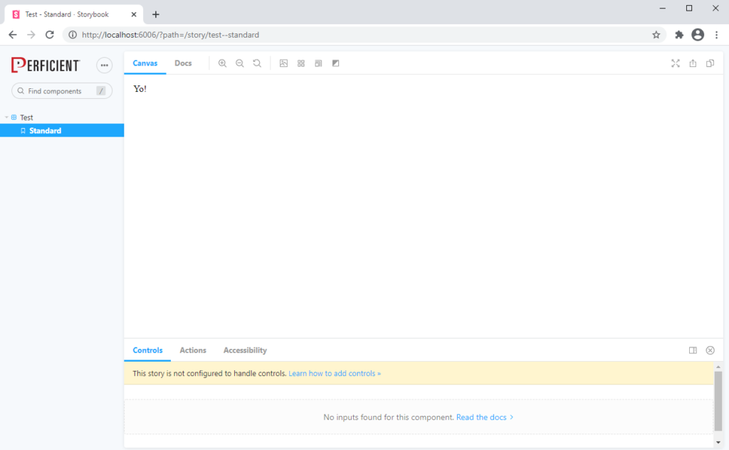
With Storybook up and running, let’s turn our focus to customizing the Storybook theme.
Part 3. Customizing the Storybook theme for your brand

You can customize a variety of parts of the Storybook UI via the theme API. With this, you can change fonts, styles, background colors, logos and favicons. In this section we will look at changing logos to represent the site’s brand.
Storybook will pick up theme API customizations from the .storybook/ folder in a file called manager.js. To update the main logo and favicon, create that file with the following contents:
theme/
├── .storybook/
│   ├── main.js
│   ├── manager.js // add this file
│   └── preview.js
└── ...
// manager.js
import { addons } from '@storybook/addons';
import { create } from '@storybook/theming/create';

const theme = create({
  base: 'light',
  brandTitle: 'Storybook | Perficient',
  brandUrl: 'https://www.perficient.com/',
  brandImage: './perficient-logo.svg',
});

addons.setConfig({ theme });
Note: The above image path is relative to the theme/public/ folder, since it was configured as the static directory in the “scripts” section of package.json. We’ll discuss working with static content in an upcoming section.
With those customizations added, stop and re-start the Storybook server and see the changes
Check the Storybook docs for more about theme customization options.
Part 4. Working with Public Assets
Storybook makes working with static assets simple. In the package.json “scripts” section, the command ends with the -s flag with the location of the directory (public). To reference images, fonts etc, add them into the public directory, and reference them via a path relative to that directory, e.g. theme/public/images/logo.svg, can be referenced with the following path:
<img src="images/logo.png" alt="alt text here" />
We found that mimicking Sitecore’s media library path was helpful in resolving URLs.
Part 5. Working with SCSS and JS in Storybook
It’s not difficult to work with SXA theme Scss and JS, but there are a few gotcha’s. This section will show you how to import your source files and resolve global variable errors.
SCSS in Storybook
In section 2 (above) we created an empty preview.js file in the .storybook/ folder. This file is for globally importing JS and SCSS assets into your project. We will be using this to import all the theme Sass into our project. To do that, just create a .scss file and import all the necessary styles. We also grab the necessary optimized.min.css files (from Sitecore) and add them to the src folder to have the grid, etc.
JS in Storybook
Importing component JS will mainly be done in the story file, and we will take a look at an example below. Global JS assets (ex a 3rd party library) can simply be imported into the preview.js file.
Working with SXA component JS in Storybook requires two main steps:
- Creating and importing a global XA object. This is needed in order to mock out the XA component initialization in your component’s exposed api. To mock this out, create an xa-mock.js file in the src folder with the below code. You can import this globally in your preview.js file.
//xa-mock.js global.XA = { component: {}, register() { } }; - Importing and initializing a component inside the story file. Since Storybook is built on top of React, each story is functional component. In order to properly initialize the component and bind to DOM elements, you need to execute the init function inside the useEffect() React hook. This will ensure the DOM has finished rendering (from React) before you try to bind event handlers etc. Let’s take a look at a simple example below.
// theme/sources/my-component.js
XA.component.myComponent = (() => {
  'use strict';

  const api = {
    initialized: false,
    init() {
      if (this.initialized) {
        return;
      } else {
        const btn = document.querySelector('#btn');
        btn.addEventListener('click', () => {
          alert('working!!');
        });
      }
    }
  }

  return api;
})();

XA.register('my-component', XA.component.myComponent);
// theme/src/stories/Test.stories.js // import useEffect hook import React, { useEffect } from 'react'; // import component import '../../sources/my-component'; // Story metadata export default { title: 'Test', }; export const standard = () => { // use useEffect hook to initialize component useEffect(() => { XA.component.myComponent.init(); }, []); return ( <div> <button id="btn">Click Me</button> </div> ) }You can see that we simply need to import the useEffect() React hook and call it inside the story component as a means to init() our XA component. This will ensure that the React render() method has been called and our DOM content has completed rendering. For more information about React hooks, see the docs.
In this section, we see that there is a little setup in order to use XA component code inside of Storybook. After the first few times, it will become second nature, or at least a template to copy/paste 😉
Before we take a look at a practical development workflow, let’s examine how to use .html or .scriban files to act as the markup for your Storybook story.
Part 6. Working with Template Code
Writing all the markup in JSX syntax can sometimes be off-putting, particularly when copy and pasting into a razor file or into a scriban block in the Sitecore content tree. (I often forget to change className to class). Luckily, we can write our template code in .scriban or .html files and import them into our story.
Taking the above example with the button handler, we can refactor it to the following:
<!-- theme/-/scriban/Test/default.scriban -->
<button id="btn">Click Me</button>
// theme/src/stories/Test.stories.js

import React, { useEffect } from 'react';
import '../../sources/my-component';

// import template
const testScriban = require('../../-/scriban/Test/default.scriban')

// Story metadata
export default {
  title: 'Test',
};

export const standard = () => {
  useEffect(() => {
    XA.component.myComponent.init();
  }, []);

  // render with dangerouslySetInnerHTML
  return (
    <div
      dangerouslySetInnerHTML={{ __html: testScriban }}
    />
  )
}
That should render and work exactly as it had before. The difference being that our template code is extracted and can be in a format closer to how it will be consumed by Sitecore. One note about using scriban files before we move on: the scriban syntax cannot be parsed via Node, since there is no node-supported parser. We have opted to use this format to act as the template contract between front end development and Sitecore implementation.
In our final section, we will discuss a practical development workflow.
Part 7. Development Workflow and Conclusion
Now that we have a better understanding of what Storybook is, how to include it into our theme, and how to use it to work with theme files and markup, let’s discuss a typical workflow.
Since front end development is now disconnected from Sitecore to allow for more rapid development, Sitecore developers can focus on creating templates and renderings while the front end developers focus on building theme assets/styles/JS. Integration is required to add the markup into Sitecore: either as .cshtml, .scriban or SSR React components. This step will be a manual process, but the markup from Storybook will provide the guide. We find it helpful to think of it as contract-first development, with the obligation being on the markup.
While the manual process of moving markup into Sitecore and keeping template code synced between Sitecore and Storybook is cumbersome, we still see a net reduction in time. Additionally, we see a real benefit with Storybook as it provides development documentation. Further, Storybook provides commands to export a static version of the site that can be deployed to a hosting server. Lastly, several DSM’s (like Invision) have integration points into Storybook to improve collaboration between design and development.